

By Adrian W.
Making a game cover for a Master System checklist:
1.Have I created a white background? Check
2.Have I added black gridlines? Check
3.Have I used a simple and big font for my games title? Check
4.Have I pasted on an image drawn and coloured in by a 5 year old? Check
When all of the above are complete you have successfully designed a Master System game cover!
SEGA seemed to have come up with a good idea regarding the covers of their Master System games; keep a similar / minimalist style across the board and use a consistent background for all games. This should help gamers feel proud of their interlinked collection of titles and possibly build a stronger brand. In principle the idea was a good but in practice it helped produce some of the worst game covers of all time.
Here are my top ten worst Master System game cover art of all time:
WARNING: These images may hurt your eyes

10. Black Belt
This is surely one of the simplest game covers ever made. Terrible text and a leg literally shooting out of the bottom left corner does little to entice you to play this game. This is laziness magnified. Even making the game title black would have been a start, but nope, the designer went with navy. The guys involved are clearly still wearing white belts.
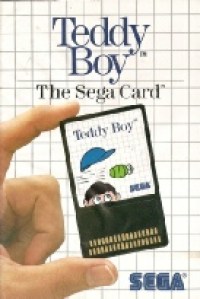
9. Teddy Boy
This will not be the last game cover to feature a picture of someone actually holding the game. It kind of reminds me of that annoying Macaulay Culkin and Ryan Gosling t-

8. Pro Wrestling
The game may be called Pro Wrestling but there is certainly nothing pro about the artwork shown here. You could almost call it amateur artwork! Why the wrestler is decapitated, yet still able to pull off a choker move is anyone’s guess. Is he strangling his own head or rival wrestlers? Also, what is with those red Speedos? Hardly an intimidating look for a Pro Wrestler! Overall a poor cover that does little to tempt you into playing this game.

7. Alex Kidd in Miracle World
The games title takes up more than half the cover. The games title should take up the whole cover so we do not have to look at the ‘drawing’ of Alex Kidd. My 3 year old son could draw a better Alex Kidd. His mutated/infected hand resembles something from your darkest nightmares. His left hand is bigger than his head for crying out load. It seems to consist of a bulbous thumb and a weird cyclical fist with one giant finger – just, no! Plus why did the artist not just continue to draw stars around his fist and instead opted to draw in a few plus symbols??

6. TransBot
Another game within a game cover now and the consistency of poor quality continues. Here at AA we are a liberal bunch, but we do cross the line when it comes to transgender robots (this one is up for debate –

5. My Hero
I can imagine it now: the game designer for My Hero was behind on other jobs (possibly coming up with pictures of a confused Optimus Prime) and had to create an image of one bad dude for the My Hero game cover quick sharp. Little time for imagination and creativity it was time to pull out the stereotype card. The bad guy needs a tattoo, a grimace only a mother could love, a skull and cross bones tattoo and a, err, red and orange striped armless vest. Throw in a fist (literally) and jobs a goodun. Poor effort all round!
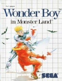
4. Wonder Boy in Monster Land
Wonder Boy looks like the villain on this game cover. Just look into his demonic and soul destroying eyes. You can tell that once the unarmed orange knight hits the ground he will have his innards ripped out and eaten for breakfast. Wonder Boy should also look to get to the barbers as soon as this fight is over because his current barnet is certainly not doing him any favours. From just looking at this cover I can safely say I hope Wonder Boy is stuck in Monster Land for the rest of his days.

3. Quartet
Quartet sounds like a game where you can select from 4 players yet the cover clearly show’s only 2 players. The top left text clearly states it is a game for one or two players – not four! Why is this game called “Quartet”? The badly drawn bald guy (Dr Evil?) with fetching yellow boots is shooting out 4 diamonds/bullets (delete as appropriate) from his tiny pistol –

2. Out Run
The cover art for Out Run certainly does not do the game justice. The car looks like it could belong to Krusty the clown! The over the top exhaust fumes look more like a cloud and do not even get me started on that purple palm tree. It looks like the worst examples of clipart have come together, mated and created this hideously mutated lovechild. The cover art could surely be improved by anyone with opposable thumbs. Actually scratch that, even a blind baboon with scurvy could do a better job!

1. Zillion
I could think of a zillion reasons why this gets my vote for worst Master System game cover art ever, but just look and let your eyes decide. What on earth is that machine on the cover? Is it a microwave, a PC or inner workings of TransBot? All I know, it is not pleasing to human eyes! From the cover I have no idea what this game could possibly be about. This game’s cover combines the uncanny skills of oozing both mystery and unbelievable dullness. Overall, Zillion is easily one of worst game covers ever released!
If you like this…

the ones holding a cartridge are like the ps1 platnium series..